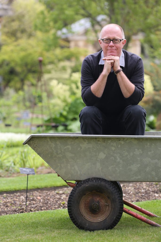
Why gardening can rank as fine art: Timothy Walker
Report by Derek Latham
Before introducing the third of the Zoom lectures of the TASS 2021
programme the chairman Colin Langley encouraged members who had not paid their (reduced) subscriptions to do so as soon as possible. The April, May and June lectures would be by Zoom, but after the summer break it was hoped that normal meetings would be resumed from September onwards.
The title of the March lecture, quoted above, gave those TASS members who were able to watch the talk on Zoom little advance notice of the whirlwind tour through the fields of English garden design, fine arts, and the science and philosophy of colour, that they were about to experience. Most enjoyable and informative, nevertheless. At times one just longed for the pause button to be able to absorb the full impact of the rapid-fire narrative and especially the content of the images of country house type gardens which flashed across the screen, including the Botanical Gardens of Oxford University, where Timothy Walker had been director (horti praefectus) for twenty-six years from 1988. His responsibilities there also included management of Nuneham Courtney and its Harcourt Arboretum, six miles south of Oxford.
The keynote of Timothy’s talk was a quotation of Gertrude Jekyll – “remember that in a garden we are painting a picture”. The precise use of colour is as important to a garden designer as the palette is to an artist. Timothy showed images of pre-historic Indonesian and South African cave paintings of animals (wall art, he called it) where it is known that colour, although now faded, had been stark and vivid at the time it was painted. The use of plant-based dyes, brown and yellows especially was known to the ancients at least as long ago as the second millennium BC and probably earlier. The Egyptians used a wide palette of colours in their decorations. Timothy also showed us Sri Lankan wall art from the 5th century AD.
Since ancient times attempts have been made to define colour. In the 5th century BC Aristotle regarded it as emanating from the four elements, earth, air, fire and water, and as being a gift from the gods. His colour scale ranged from 1 (white) to 8 (red). Sir Isaac Newton identified the seven colours of the rainbow as being the basis of his colour scale; interestingly to him the prime colour was green although it was not in the centre of the spectrum, but because, he said “green in the natural world is central to our lives”. In 1821 A G Werner propounded a scale of 121 colours with the prime colours all having a number of shades. This had led on to the more complex screen-based systems of today.
In a garden, Timothy said, colours have to be chosen with great care. A monochrome garden is just possible – as long as it is green! But in a normal colourful garden the effect of the seasons, the time of day and the position of the sun all have to be taken into account, and he showed a quick succession of garden images where colour shades were harmonious and some where the contrast in hues was equally eye-catching. This was where the pause button would have been useful. And the juxtaposition of plants must show their harmonies or contrasts to best advantage, although he acknowledged that Gertrude Jekyll always chose harmony rather than contrast in her designs. Of course taste is subjective: Timothy quoted his mother who passionately hated one Chelsea garden “because it was all orange”. One Oxford (unnamed) philosopher was heard to say “Dahlias are so working class!”. Timothy himself always enjoys a bus ride into Oxford because one house along the Iffley Road has a most tastefully chosen and ever-changing panoply of colourful plants in the garden. Fall in New England always has a glorious range of reds and oranges. Timothy commended the work of Andrew Lawson, an artist turned photographer, whose superb photographs have illustrated the books of gardeners such as Penelope Hobhouse, Rosemary Verey and even the Prince of Wales.
Certain colours are associated with certain cultures, locations or situations. Green is the colour of Islam, it seems. The Scrovegni Chapel in Padua is unashamedly blue (and well worth googling). Brown is the autumn colour. Is euphorbia yellow or green? Or yellowish-green? Careful, here – Timothy is the author of the RHS Wisley hand- book on euphorbias. Tongue in cheek perhaps, Timothy wondered whether Abingdon School now rues the choice of pink for its oarsmen’s garb and blades.
Timothy was asked how shape ranked with colour in garden design. Certainly shape was of great importance, he said, but in his view came second.
A wide-reaching and thoroughly engaging hour. Timothy Walker called Yorkshire his spiritual home. A nod to his guests for the day, perhaps, but let us not forget that after taking his degree in botany at University College, Oxford, he finished his education at Askham Bryan.
Timothy Walker
Since 1986 I have given 1,500 public lectures. This was originally part of my work as director of the Oxford University Botanic Garden from 1988 to 2014. Botanic gardens are often described as living museums, and garden curators lecture about them in the same way as museum curators talk about their collections. Since 2014 I have been a college lecturer and tutor at Somerville College Oxford. Gardens are often thought of a place where science and art meet on equal terms. My lectures investigate this relationship.


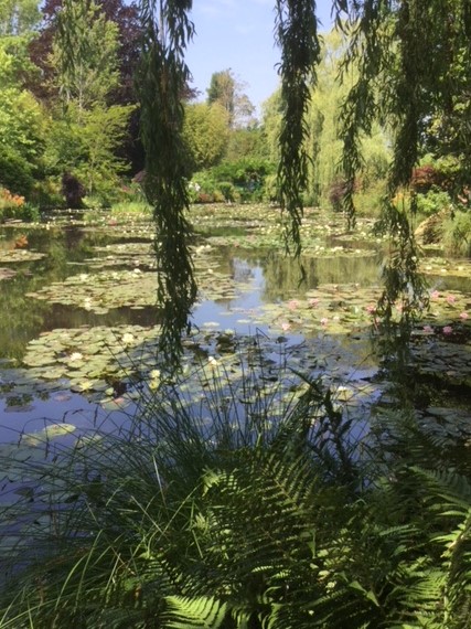
Monet’s Garden
March 2021 Lecture
(Picture taken by Sandra Ineson-Parloujr)
